
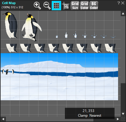
In the Cell Map Window, the reference image of the Cell Map selected in the Project Window will be displayed.
There are two main types of window operations: toolbar operations and image operations. A description is provided for each.
Operation By Toolbar
On the toolbar of the cell map window, buttons to change the display state of the reference image are accommodated mainly.
 Zoom In Zoom In |
Increases the displayed magnification of the reference image. |
|---|---|
 Zoom Out Zoom Out |
Decreases the displayed magnification of the reference image. |
 Show Grid Show Grid |
It switches Show/Hide of the grid on the reference image. When the button’s background color is blue, Show. When it is gray, Hide. |
 Snap To Grid Snap To Grid |
Snap the rectangle to the grid when you specify a range or move the rectangle. If the button background color is blue, it snaps to the grid; if it is gray, it does not. The snap state changes each time you click the button. You can snap the grid even if it is not visible. |
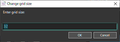
 Change Grid Size Change Grid Size |
The Change grid size Dialog opens. You can specify the size of the displayed grid in 2 to 256 pixels. |
 Change Grid Color Change Grid Color |
Changes the color of grid lines. Click the button to display the Color Picker window and set the desired color. |
 Change BG Color Change BG Color |
Changes the color of the background. Transparent portions of the reference image are displayed in the background color. Click the button to display the Color Picker window and set the desired color. |
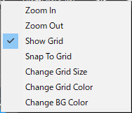 If you narrow the window so that the toolbar cannot be displayed, a
  mark appears at the right end of the toolbar. Click this mark to open a menu list of buttons that are not visible. Select this menu to perform the function of each button.
The menu image is for when all buttons are hidden. The actual menu displays only the hidden buttons.
Operation on Image
On the display image, you can create cells, change the specified range of cells, check cell rectangles, and so on. When a cell is created and registered, it is displayed in the cell list window.
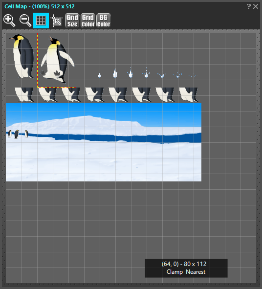
When a new range specified on the display image, the rectangle is shown by the “white and black dotted line”. By double-clicking this rectangle (meaning to select “Create Cell” from the right click menu inside the rectangle), the area can be newly added to the “Cell List” as a “Cell”.
Also, the rectangles of the cell which are already registered in the cell list are shown by the “red and yellow dotted line”. By dragging this rectangle and changing the sizes, the pattern design of the already-existing cell can be changed.
Context menu outside the rectangle
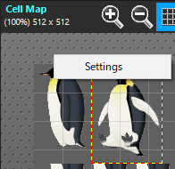 Right-click outside the rectangular area to display the context menu.
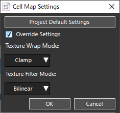
| Cell Map Settings |
The Cell Map Settings Dialog opens. Changes the settings of the currently selected Cell Map.
Project Default SettingsThe Project Settings Window opens. When the window opens, go to “Default Settings” – “Cell Map”. Override SettingsCheck to enable individual texture settings for the currently selected Cell Map. Texture Wrap Mode:Sets the Texture Wrap Mode. Texture Filter Mode:Sets the Texture Filter Mode. For more information on Texture Wrap and Texture Filter, see the following links.
|
|---|
Context menu within a rectangular range
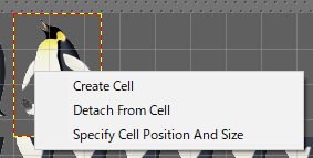
Right-click inside the rectangular extents to display a context menu.
| Create Cell |
Adds the specified rectangle as a New Cell to the Cell List. |
|---|---|
| Detach From Cell |
Changes the state of the selected rectangle to a new rectangle that is no longer associated with an existing cell. If you change the rectangle after running this menu, it does not affect the previous cell. This menu is useful when you want to create a new cell that has the same shape and size as an existing cell. |
| Specify Cell Position And Size |
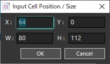
The Input Cell Position / Size Dialog opens. Specify the location and size of the rectangle in pixels. Specify Location
Specify Size
Note:If the origin of the cell is in the upper-left corner and you set X and Y values to 0, the rectangle is moved to the upper-left corner of the image. |
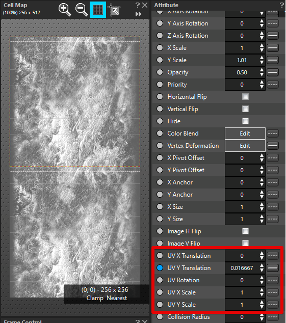
Viewing UV animation usage ranges
Select the Parts for which you have set the “UV X Translation”, “UV Y Translation”, “UV Rotation”, “UV X Scale”, and “UV Y Scale” attributes. When selected, the range used by the UV animation appears as a white dotted border above the Cell Map.
The conditions under which the range used by the UV animation is displayed.
- You have set any of the following attributes on the selected part: “UV X Translation”, “UV Y Translation”, “UV Rotation”, “UV X Scale”, and “UV Y Scale”.
- The Cell Map displayed in the Cell Map window matches the stored Cell Map for the Cell set in the Reference Cell attribute of the selected Parts.
Work with range borders for UV animation
| Drag Inside Border |
Change the values of the “UV X Translation” and “UV Y Translation” attributes. |
|---|---|
| Drag corner of border |
“UV Rotation” Change the value of an attribute |
| Drag border |
Change the values of the “UV X Scale” and “UV Y Scale” attributes. |
Related Pages
- Project Window
Describes the features of the Project Window. - Project Settings Window
Describes the features of the Project Settings Window.